A new logo / website for https://supercritical.net
When I founded my company in 2007, I chose the name Supercritical Industries for several reasons, one of which was the connection with the physics concept of supercritical mass. This term refers to the amount of reactive material needed for a sustained nuclear reaction to take place. As a consultant, I've always made it my goal to focus on where I believe technology will be in a few years time, and help small-stage startups working in the same field grow their ideas from inception up to the point where the company becomes self-sustaining.
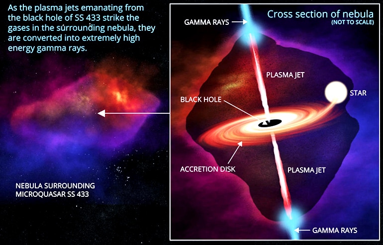
Another scientific concept which I feel works as a good analogy is "supercritical accretion". This term refers to an astronomical effect, where mass being drawn into the gravitational well of a black hole forms a two dimensional accretion disk that orbits the black hole. As this mass orbits, the mass nearest the center of the black hole gets drawn in, resulting in a spiraling jet of plasma perpendicular to both sides of the accretion disk. The immense gravitational forces involved, combined with the distortion of spacetime around the black hole, cause particles that narrowly miss being pulled into the black hole to be ejected in highly energetic forms - literally ripping apart atoms in the process. This plasma stream then interacts with surrounding nebula gases to emit gamma rays, which we can see with our radio telescopes on earth.
Some artist renditions of what this looks like:
I like this analogy as a comparison to the web. The web is like a black hole, a concentration of immense mass, accreting all the information that enters its vicinity and transforming it into new forms. This information is not destroyed or lost when it enters the black hole, but instead it is preserved in a holographic form. I think this is a perfect metaphor for my work with representing information from the web in 3d and virtual reality, so this is what I think I'd like to base the design on. Plus, a black hole tearing apart a red dwarf just looks fucking awesome, and fits nicely with the fact that Elation Engine started its life as a space sim engine anyway. On top of all that, the ideal system for us to model our logo on is called v404 Cygni...another web connection!
When people first land on the page, I'd like the page to look familiar enough to someone who uses the modern web. It should feel like a company website, with a fancy animated hero image running fullscreen in the background. Information should start off laid out as a standard 2d website - company information, our mission, techologies we work with, etc. As the user scrolls down the page, the background animation should play forward some camera or action sequence - probably something like the spinning of the black hole / accretion disk starts off lazily spinning, a nice idle animation, but the frther down you scroll the more it zooms in to the center, everything stars to speed up, until eventually you enter the black hole and there's a flash of light and everything in the 2d page pulls apart and becomes part of a larger 3d world, wth information now spatialized around you. A first person walk-around view should be available at this point, but the default interaction should still feel more "web-like" where you're scrolling and clicking and navigating through content while the 3d scene moves around you, navigating automatically to the appropriate content.
We're going to start off trying to recreate the first image linked above, since it's the most visually stunning. Let's break it down into its elements: